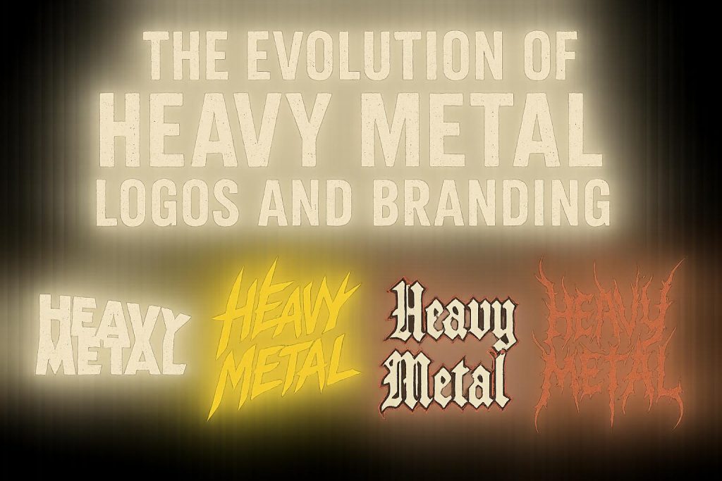
The Evolution of Heavy Metal Logos and Branding

The Beginnings of Heavy Metal Logos
The evolution of heavy metal logos and branding is an intriguing reflection of the dynamic history and transformation of the genre itself. In the late 1960s and early 1970s, heavy metal began to take root with influential bands like Black Sabbath, Led Zeppelin, and Deep Purple. During this formative period, the branding and logos associated with heavy metal bands were relatively simple. They typically revolved around bold typography prominently displaying the band’s name. Often, the typography in these early logos drew influence from the psychedelic and traditional rock aesthetics prevalent at the time.
The Influence of Early Heavy Metal Art
As the 1970s progressed, the visual elements and imagery associated with heavy metal began to engage more deeply with darker and more intense themes. Black Sabbath played a key role in introducing ominous and Gothic elements into their visuals. Such components gradually made their way into the design of logos, laying the groundwork for future heavy metal branding approaches. Album covers from this era frequently featured artwork that incorporated supernatural or mythical elements, merging seamlessly with the evolving styles of logo design.
1980s: The Iconic Era of Metal Logos
The 1980s can be considered a pivotal era in the history of heavy metal logo design. During this decade, bands such as Metallica, Iron Maiden, and Slayer achieved remarkable commercial success, and their logos became iconic symbols of the genre. These logos exhibited intricate details and aggressive styling, aligning them with the intensity characteristic of heavy metal music.
Visual elements such as Gothic and fantasy themes became commonplace, with sharp angles, bold fonts, and a metallic color palette dominating the scene. A classic example is the Iron Maiden logo, which became easily recognizable with its angular, block letters designed by Dennis Wilcock. Additionally, Metallica’s logo—envisioned by James Hetfield and finalized by Mark DeVito—features a distinctive lightning bolt motif, effectively encapsulating the band’s high-energy style.
Adaptation and Modernization: 1990s and Beyond
The 1990s saw a diversification in the genre, accompanied by an evolution in the aesthetics of heavy metal logos. Bands began to incorporate elements from various subgenres, such as death metal, black metal, and nu-metal, resulting in more diverse branding approaches. For instance, death metal bands often chose logos with chaotic and seemingly illegible designs, fostering an insider culture exclusive to fans. In contrast, nu-metal bands like Korn and Linkin Park opted for more simplified, modern designs, reflecting a maturation in both musical style and audience expectations.
During this era, graphic design technology advanced significantly, enabling bands to experiment with designs that could more easily convey their distinct identities. The logos of the 1990s reflect this technological expansion, showcasing a wider variety of styles and aesthetics to better align with evolving fan preferences.
Digital Age and Contemporary Trends
In recent years, the rise of digital platforms has further influenced the development of heavy metal branding. Today, heavy metal bands utilize social media, streaming services, and digital design tools to create a robust brand presence. As a result, contemporary logos often need to function effectively across a wide array of digital formats and merchandise.
Emerging bands frequently adopt flexible logos that are easily recognizable in both print and digital media. Despite these advancements, there remains a deep-rooted reverence for classic logos from the 1980s, which continue to exert a significant influence on new designs. This enduring appeal maintains a connection to the genre’s rich heritage while adapting to modern contexts.
Overall, the evolution of heavy metal logos and branding represents a continuously unfolding dialogue between tradition and innovation. This interplay resonates with the broader cultural and artistic currents within the genre, ensuring that heavy metal remains an adaptable and evolving force within the music industry.
In conclusion, the journey of heavy metal logos from their simple beginnings to their contemporary complexities underscores the genre’s rich history of artistic expression. Logos have become pivotal in capturing the essence and evolution of heavy metal when history is considered in conjunction with musical development. As heavy metal continues to evolve, its logos will undeniably continue to serve as critical icons representing the genre’s resiliency and adaptability in a changing world.